Thursday, March 23, 2017

Reproducing a Kandinsky Painting in Pochoir


The main artistic work of pochoir ateliers in Paris in the 1910s was to reproduce facsimiles of manuscripts and paintings in limited editions; they also added color to printed (phototypie) fashion plates in fashion magazines.  Many large printing firms had a contingent of pocheurs in addition to an on-site bindery, like Crété in Corbeil, the company that printed La Prose du Transsibérien.

I wanted to work with pochoir again in my Typography class at Scripps College, and so I invited Julie Mellby to give the Fall 2014 Frederic W. Goudy Lecture for the Scripps College Press on the history of pochoir. She is the graphic arts curator within Rare Books and Special Collections at Firestone Library, Princeton University. Normally the Scripps College Press offers a workshop to accompany the lecture. I thought it would be possible to reproduce a Kandinsky painting in a small edition with the workshop participants. I was still working on a timeline for the production of the pochoir for La Prose, and I hoped this experiment might give me some clues.

In 1988, I had taken a pochoir workshop where we made the stencils from acetate and worked with French pochoir brushes, so I taught the workshop. My husband had mentioned that our Kandinsky calendar probably had a good candidate for attempting a pochoir reproduction, so I chose the Landscape Near Murnau with Locomotive painting from 1909.

Kandinsky, Landscape Near Murnau with Locomotive, 1909

Since there would be fourteen participants, including Julie Mellby, and there were fourteen colors in the painting, it would be a test to see if we could produce an edition of sixteen copies in one day-long workshop. 

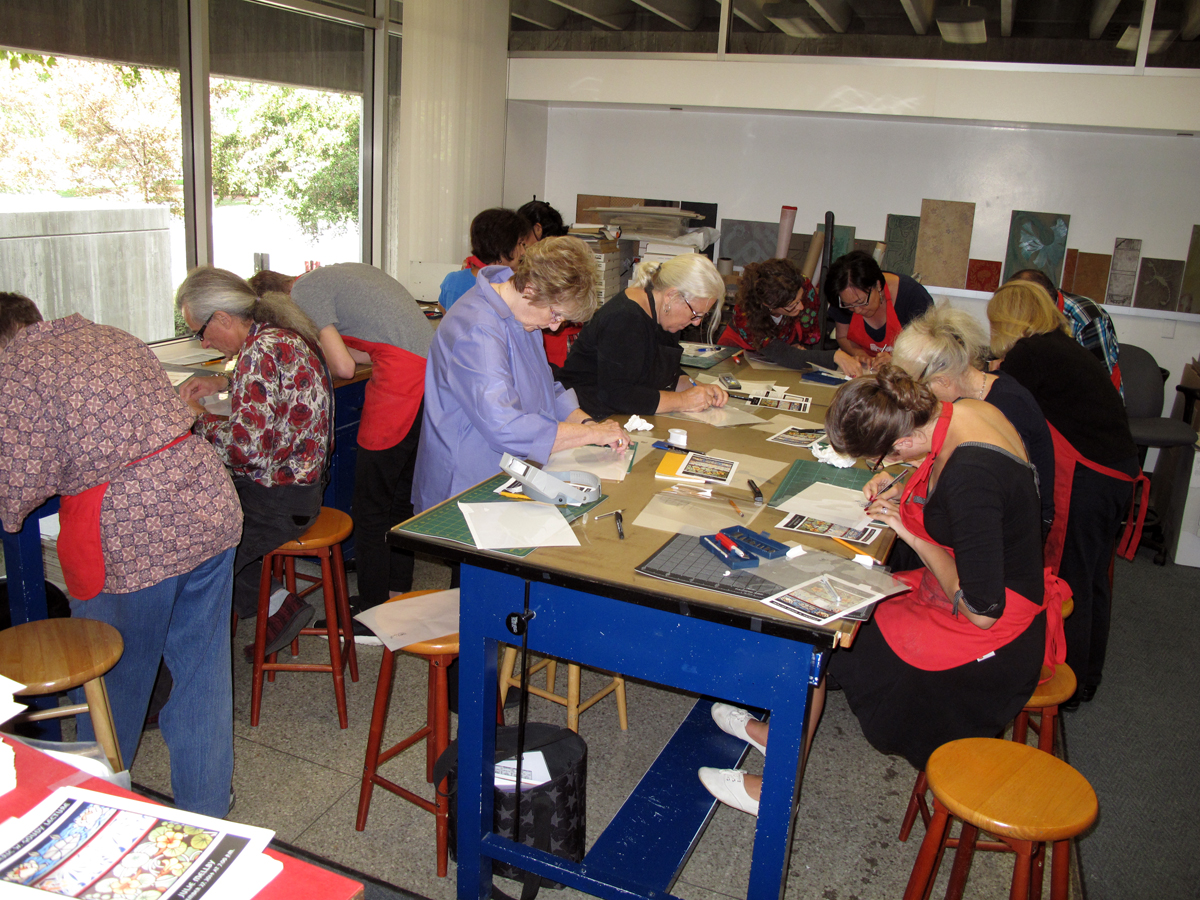
Workshop participants cutting stencils

The first task is to identify all of the colors in the painting and make a tracing. 


Tracing of the fourteen color areas

You’re looking for areas that might need a bridge; for example, if you have a donut shape, you have make a bridge from the center circle to the outer circle to connect the two. I made color copies of the painting and copies of the tracing so that each participant could choose a color. A registration system with a three-hole punch was developed, where I punched holes in both the Bristol paper and the acetate stencils.

Each participant had to mix their own gouache color to match the color photocopy, and write down the recipe on a card. 

Gouache color swatches with recipes
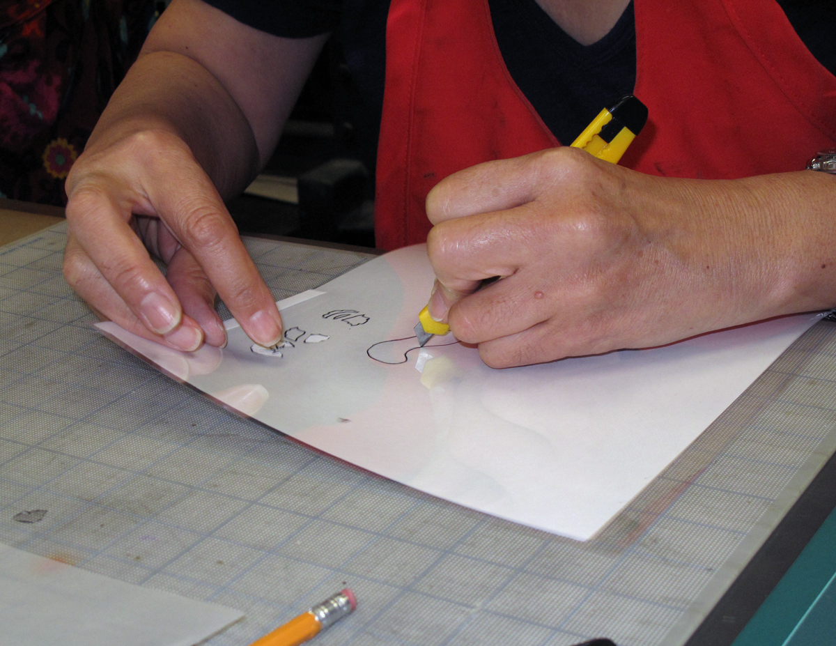
With a black narrow marker, they traced their color areas onto acetate and then cut away those areas with a knife. 

Knives used for cutting included Olfa (my favorite), X-acto, and inexpensive snap-off knives (above)

I brought in several different kinds of knives and let them choose whichever one worked well for them. It is difficult to cut tight curves in acetate because the plastic pulls up while cutting, so they practiced first.

The gouache is mixed to the consistency of milk in a canister. We bought a double-cup holder for the gouache. You charge the fat French pochoir brush with a small amount put into one cup and swirl it around in the second cup. Then you test on scrap paper to make sure you are not too wet. One of the challenges of editioning is to add just the right amount of gouache to the brush each time you are ready to do the pochoir. Attach the acetate stencil to the paper using the registration system and swirl lightly in your color areas until you build up to the intensity of color desired.


Swirl in a continuous circular fashion with the French pochoir brush

If your brush is too wet, the color will seep under the hole. The paper you use is critical, since the paper could abrade easily if it is too soft. We used medium-weight Bristol paper.

Normally each pocheur would complete the edition in her color, and then go on to the next color in succession. But in this workshop, the participants had different completion times because some pochoirs were more complicated, so the order was random.

Example mid-stream with eight colors
Example mid-stream with different colors completed

We numbered the edition pages to keep track. My press assistant, Chris Yuengling-Niles, made an accordion-fold exemplar of all the colors in order.

Progressive proofs in order by Chris Yuengling-Niles

 We completed all the pages by the end of the workshop, hooray! But note that the cloud painting did not get done at the very end, so the participants would have to finish that last area at home. 

The final proof (before cloud painting) compared to the original photocopy

I knew from reading Jean Saudé’s 1925 book on pochoir, Traite d’enluminaire d’art au pochoir, that they originally used metal stencils: copper, tin, zinc, pewter and aluminum in various thicknesses. I wished that I could see one. I had gone twice in 2014 to the Firestone Library at Princeton for research, and on the second trip, I actually discovered one of Saudé’s copper pochoir stencils, which was stunningly intricate. It had originally been included in the deluxe edition of Saudé’s book and got separated until I found it in the collection. You can see this amazing stencil in a Princeton blog post written by Julie Mellby. If you want to read Saudé’s book in English, Havilah Press commissioned an English translation of two sections of Saudé’s text, and published this in 2013 in a limited edition, accompanied by an introduction outlining the history of pochoir, two pochoir illustrations, and a list of references.

I had experimented with various thicknesses of copper and aluminum for my own stencils for La Prose, but even after reading Saudé in French, it was not clear how to cut into the metal effectively. There is a drawing of the knife they used, the blade of which is slightly curved. When I discovered that Atelier Coloris in France was using the original techniques, I wrote to them and asked if they would work with me. The next blog will be about the magnificent time I had in Ploubazlanec with Nathalie Couderc and Christine Menguy, and how to cut and use the metal stencils.


Monday, March 13, 2017

On Color in "La Prose"


Early in my study of La Prose, I thought I might know why its makers failed to achieve the projected edition number of 150 copies: perhaps it was the complicated pochoir.  I thought that it might have been so complex that perhaps the edition wasn’t even completed by the time WWI came around. If I could make my own facsimile of La Prose, then I could possibly figure out how long it would take one pocheur to complete 150 copies. Therefore I would know how long it might take if several people worked on it. The first few copies were done by November of 1913; if the pochoir process took a year or more (if only one pocheur was working on the book), then the start of WWI in August of 1914 could have interrupted the pochoir work on the book.

In early 2012 I embarked on a study of the making of La Prose and the pochoir techniques used in the book in 1913. Marcia Reed, Chief Curator at the Getty Research Institute, was extremely helpful and allowed me to photograph and study the copy at the GRI (#124). I needed to find out how many stencils were required for the four-page book (one stencil per color). Note that the four pages making up the book were glued together by overlapping the approximately 14 x 20-inch pages, and then folding the more than six-foot-long book in half, and finally folding the book into 21 panels (or 20, or 22 panels). The book was normally glued into its folded and painted vellum cover, although the Getty copy was separated from its cover.

In order make a facsimile of La Prose du Transsibérien, I would have to study the color choices Sonia Delaunay made for her imagery.  I printed out my photogaphs of the Getty copy, but of course, the colors on my computer screen and my printed images would be rather different from the original. In order to make a detailed study, I made basic tracings of the color areas on the first page using the very handy Yale facsimile, noting overlapping areas.

Basic tracing of the first page of the Getty copy of La Prose.
 The next step was to give each area a basic color indication, red, yellow, blue, orange, noting tints and shadings and areas that weren’t painted. Each major color on the first page was then given a Pantone number, which includes a recipe for mixing ink colors for printing.

Marking up the first page with color indications.
Detail of early markup of lower left corner of first page.
 The next three pages were analyzed next, identifying matching colors while looking for new colors to pop up.

Marked-up tracing of page 2.
Detail of tracing of page 2.
Marked-up tracing of page 3.
Marked-up tracing of page 4.
The Pantone chart is printed in ink by the offset process, but the original imagery is painted with gouache. So I had to make my own gouache charts to supplement the Pantone choices in order to pin down the colors more accurately in the Yale facsimile. 

Gouache charts.
Meanwhile, I was teaching full-time at Scripps College and making letterpress books in editions of about 100 copies with my students in the typography class every semester, as well as teaching a Core Curriculum class. So it wasn’t until June of 2014 that I was able to take all this data back to the Getty to compare the original colors to the Yale facsimile colors. I laid out the Yale facsimile next to the Getty original copy, brought my Pantone and gouache charts and my printed photographs.

 Comparing the Getty copy, Yale facsimile, and gouache samples at the Getty Research Institute in June, 2014.
Every color was re-evaluated and a master list of Winsor-Newton gouache colors and Pantone colors was developed. 

Working on a color master list.
 My research took me to Princeton University in October of 2013 and again in July of 2014. Julie Mellby, the Graphic Arts Librarian, oversees the Charles Rahn Fry pochoir collection among many others. I was able to order books to study from the collection, and I actually found a Jean Saudé pochoir copper stencil from his 1925 deluxe edition pochoir book that they did not realize that they had. I’ll write more about the metal stencils used for pochoir later, but Julie was able to arrange for me to see the La Prose copy at Rutgers University nearby (#97). It was framed and under glass, but had once been folded into 21 panels. I compared my color charts to this copy as well, and later they helpfully sent me a photograph of La Prose for further research.

On that same trip in July 2014, my husband Gary and I visited our son Jason and wife Yuka who were living on Roosevelt Island in New York. Jason had made plans to play golf at his alma mater, Yale University, with his Dad and two professors, so I had the opportunity to view the Yale copy (#131) at the Beineke Library. 

Comparing the Beinecke copy with gouache samples at the Beinecke Library, Yale University in July, 2014.
 Timothy Young, Curator of Modern Books and Literature, who conceived and oversaw the project to print the Yale facsimile in 2008, met with me to discuss my findings. The vellum cover was still attached to the Yale copy on the map side, and the imagery did not fold toward the text, as in the Getty copy. Tim brought out the prospectus which was used for publicity, and I was able to photograph it alongside my color swatches as well as take extensive photographs of the Yale copy. I modified one of my color findings after studying the Yale original, but the colors were unsurprisingly similar to and as vibrant as the Getty original. 

Come back next time for the next step in my journey with La Prose.

Sunday, March 5, 2017

Welcome to this exciting project!

The first time I saw the fold-out copy of La Prose du Transsibérien (#37) in the July 1987 issue of Fine Print, I was struck by the vibrancy of the imagery and the unusual presentation for a book published back in 1913. I couldn’t believe that the imagery was done by "pochoir," a French stencil technique used for fashion prints and in limited edition books at that time. The techniques were far more painterly than those I had learned in a pochoir workshop that I took in 1988, where we used 5 mil acetate for the stencil and a dry French pochoir brush with gouache.

When I discovered that there was an original copy of the book at the Getty Research Institute (#124), I asked Marcia Reed if I could bring my Women of Letters group (founded in 1980, all letterpress printers) to view it. The elaborate opening of the folds, seeing nothing at all until the last unfolding, created a dramatic moment that was certainly intentional. I read that painter Sonia Delaunay and poet Blaise Cendrars had not completed the projected edition of 150 copies, and I wondered why. Thus began my eager quest to find out more about the pochoir techniques used for La Prose, and to research why the edition was not completed. (You can read my conclusions in the article in the pages area.) Absolutely essential for my research has been the offset facsimile of La Prose (#131) published by Yale University in 2008, now out of print.
The 2008 Yale facsimile.

I found Nathalie Courderc and Christine Menguy at Atelier Coloris in Ploubazlanec, France from an online article by Paul Zwartkruis titled, Masters of the Pochoir. I realized that they were probably the only commercial firm left who understood the techniques that were in place in 1913. They had been trained by the venerable firm Daniel Jacomet in Paris, where they used metal stencil plates and a wet brush. I worked with Atelier Coloris for a week in 2015 while on a month-long research grant from Scripps College.

One day that week, Nathalie Couderc drove me across the Brittany peninsula along a maze of curving roads to visit Mme. Miriam Cendrars, age 95. Mme. Cendrars is Blaise Cendrars’ daughter, and wrote a book about her father. She also produced a facsimile of the Geneva copy of La Prose (#11) in 2011, which sold out within two weeks. As we drove back from the visit, I became convinced that a new version of La Prose could be done with original pochoir, now that I had found Atelier Coloris. Mme. Cendrars gave me her son’s contact information should I need to obtain permissions.

I am now in the process of producing a re-creation of La Prose du Transsibérien in an edition of 150 copies. I will work with printer/type collector Michael Caine in Paris to typeset and print the book. I will take the printed sheets to Atelier Coloris to work on the pochoir with them. Then the pages will be bound and the vellum covers painted in oils at my own Two Hands Press. The first copies are projected to be completed by November of 2017. Pre-publication sales information will be available in due course.

Atelier Coloris


Nathalie Couderc and Christine Menguy at Atelier Coloris

In this blog, I will discuss the distinctive production techniques used for the pochoir and explain how I discovered that Blaise used 38 typefaces for his poem. I will show where the book was printed and where the pochoir was probably done. The variations in the numbering of the edition and in the folding of the book will be addressed. I’ll have step-by-step photos of various pochoir techniques, and of the typesetting, printing and binding processes.  For general information about the project and my work, please click the links on the right-hand side of the page.

My long-term goal is to re-introduce the original pochoir techniques so that book artists have a revitalized tool to add to their repertoire. In that vein, I asked Talas a few years ago to start importing pochoir brushes. For an explanation of early pochoir technique, I recommend the 1925 book by Jean Saudé, Traité d’Enluminure d’Art au Pochoir. In 2013, Havilah Press commissioned an English translation of two sections of Saudé’s text, and published this, in a limited edition, accompanied by an introduction outlining the history of pochoir, two pochoir illustrations, and a list of references.

 In my next entry, I will show how I started my investigations with gouache color swatches and a Pantone color chart.